WDCH
INTERACTIVE | PRINT
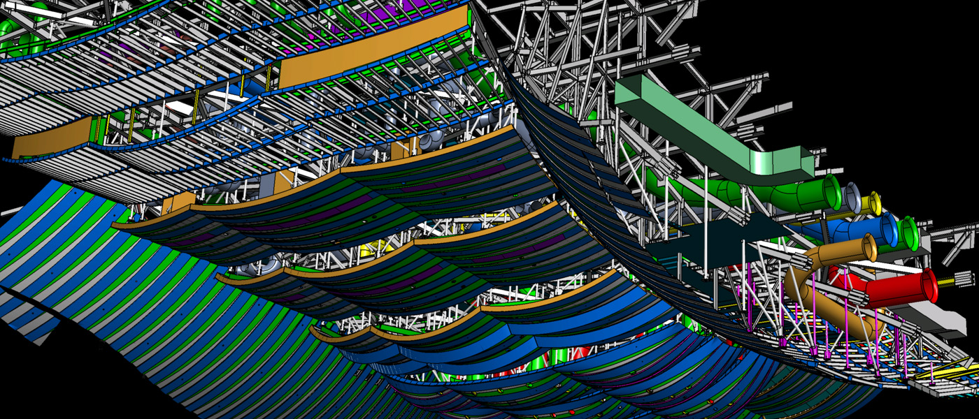
Confluences - Walt Disney Concert Hall. The interactive media and print publication took viewers through the 15-year design and realization of The Walt Disney Concert Hall, illuminating a complex web of confluences, inter-relationships and paradigm-shifting innovation that came together to create this landmark project.
Why
The beautiful forms and world-class acoustic space of The Walt Disney Concert Hall came together from a complex and intricate web of interrelationships in four key areas: The design process, acoustics, building engineering and realization, and the internal systems. The overlapping competencies and relationships profoundly influenced the evolution of the Concert Hall - over its long history of development. It was a fascinating story that needed to be shared.How
We created an interactive project to encourage the exploration of the space and expose the hidden features and building systems. By adopting a navigation-in-context approach users were able to stay oriented and also see how building features were related to parameters in other areas, and how they influenced each other. Users could tour the entire Concert Hall, and see how the building design process, fabrication, acoustics, architectural considerations, and construction technologies all came together. Users gained a deeper understanding of the 3D technologies invented and perfected over the 15-year creation of this striking landmark for the city of Los Angeles.Result
The interactive helped to evangelize Gehry's design process of using 3D technologies in unexpected ways. The interactive was available as a CD-ROM and printed publication and kiosk, and it was used by Concert Hall tour guides and docents to educate and orient tour participants, prior to taking them on a physical tour of the building – enhancing their experience and appreciation of the building components.Role(s)
Creative Director, Project ManagerIdeation, Project Lead, Team Development, UX/UI


FRANK GEHRY – Digital Project
EXHIBITION DESIGN
The Digital Project. Gehry's pioneering application of 3D processes from initial design through engineering, fabrication, construction, and contracting has had a paradigm-shifting impact on the AEC industry and built landscape. The Digital Project was a multi-screen video exhibition that engaged museum visitors with an in-depth look at this innovative and far-reaching application of 3D. The exhibition toured multiple venues, including MOCA-LA, Vitra, Milan Triennale, Design Museum, National Building Museum, Corcoran, among others.
Why
Gehry's architecture was realized in a context of a deeply constraining architectural-engineering-construction practice. Engineering and Construction tended to dominate Architectural decision-making. In Gehry's words 'infantilizing the architect'. How was it possible to realize visionary design in a context that disempowered architectural innovation? Gehry's team began including 3D technology solutions from other sectors in the design process, including Aviation, Shipbuilding and CAD/CAM manufacturing. Over time, this allowed for radically innovative architecture to be built on time and on budget and eventually created a major paradigm shift in the global AEC industry. This was a story of radical innovation and change that needed to be shared.How
Building on learning from an earlier Gehry commission for a video installation for the Gehry Retrospective at MOCA-LA, we developed the framework for a large-scale, touring video exhibition. Interviews were conducted at Gehry's studio with senior staff, using a green screen. The various stories were woven together to create a comprehensive understanding of the many systems and considerations that came together. The audience was invited to wander through an open space of video monitors, graphics, and physical displays, with looping video and motion graphics. Audio domes (and headphones) drew viewers deeper into a complex, layered narrative about the 3D parametric design process that had been created to realize Gehry's architecture.Result
The original MOCA-LA video installation was an energetic locus within the Gehry retrospective exhibition. The Digital Project exhibition built on this success by engaging viewers through directed audio and video illustration, drawing them into the narratives under sound domes and headsets. This participatory engagement opened the doors for viewers to reach a deeper understanding and appreciation of a highly complex narrative. The project's success was demonstrated by an extensive touring schedule at international cultural venues, which followed the initial exhibition at The Danish Architecture Centre.Role(s)
Creative Director, Project ManagementIdeation, Concept/Content R&D, Project Team Lead, Director of Video, UX/UI


Installation – MOCA-LA
Exhibition Design
Gehry Retrospective – MOCA-LA
This video and sound installation was created for a major Frank Gehry retrospective at MOCA-LA. The multimedia installation focused on the studio's iterative design process and the integration of traditional and digital techniques, including 3D technologies, sketches, technical drawings, and physical models.
Why
The exhibit aimed to shed light on the iterative methodology behind Gehry’s architectural practice, emphasizing the connections between his creative exploration, technical development, and collaborative studio processes. By showcasing these aspects as elements within a holistic context, the installation provided insights into the innovative and iterative nature of Gehry’s approach to design.How
We developed a multi-screen installation featuring looping video segments on key themes, supported by short audio clips within an ambient soundtrack. This setup offered a layered experience, guiding visitors’ attention to different aspects of Gehry’s work while illustrating the interconnectedness of his creative process. The installation encouraged audiences to engage with the content and gain insights into how sketches, models, and technology come together in Gehry's projects.Result
The installation was well-received, drawing visitor engagement during the MOCA-LA Gehry Retrospective. It offered an accessible and engaging entry point into Gehry’s work, enhancing visitors’ understanding of his design philosophy and the collaborative processes behind his iconic architecture.Role(s)
Creative Director, Project Manager Concept Development, Audio-Visual Design and editing, Installation Management

Gehry Technologies
Visual Identity & Iconography Program
Gehry Technologies grew from 3D technologies to support in-house development into a large commercial software suite. GT commissioned development support for UX/UI, Iconography systems, and visual identity for the commercialization of the software suite.
Why
Digital Project Software Suite grew from a series of in-house technology solutions. The software suite called for further evolution in UX/UI and a new visual identity for Gehry Technologies.How
Assembling a small team, we designed a clear language for the Digital Project iconography program, and working with the GT management team, we developed a new visual identity, collateral material, and brand guidelines for Gehry Technologies.Result
A fresh visual identity, and comprehensive iconography for the Digital Project software.Role(s)
Creative DirectorDesign Lead, Visual Identity and Iconography, UX/UI


GLENN GOULD
Interactive design
Glenn Gould: The New Listener. Interactive media exploration of Glenn Gould's prolific musical expression, and the connections between his views, opinions, and life experience. The project won several awards including a NEMN Silver Apple, and an EMMA.
Why
Glenn Gould is one of the most celebrated classical pianists of the 20th century. He was also a writer, composer, conductor, and broadcaster. A colourful, prolific figure, the story of Gould's life and its influence on his music was a story waiting to be told.How
Gould's personal life was woven into his profound musical engagement. The project team created immersive, interactive environments in which his work, personal experiences, and opinions could be experienced more fully. The interactive recreated Gould's original musical experiments with contrapuntal music passages, allowing users to enter Gould's world and create and experiment with his original master recordings.Result
Glenn Gould: The New Listener won a number of awards including a NEMN Silver Apple and an EMMA. The project allowed people to experience a different side of this cultural icon and gain a deeper appreciation of the very real person behind the musical genius.Role(s)
Creative DirectorDesign Lead, Concept R&D, UX/UI


ALETTA
Industrial Design
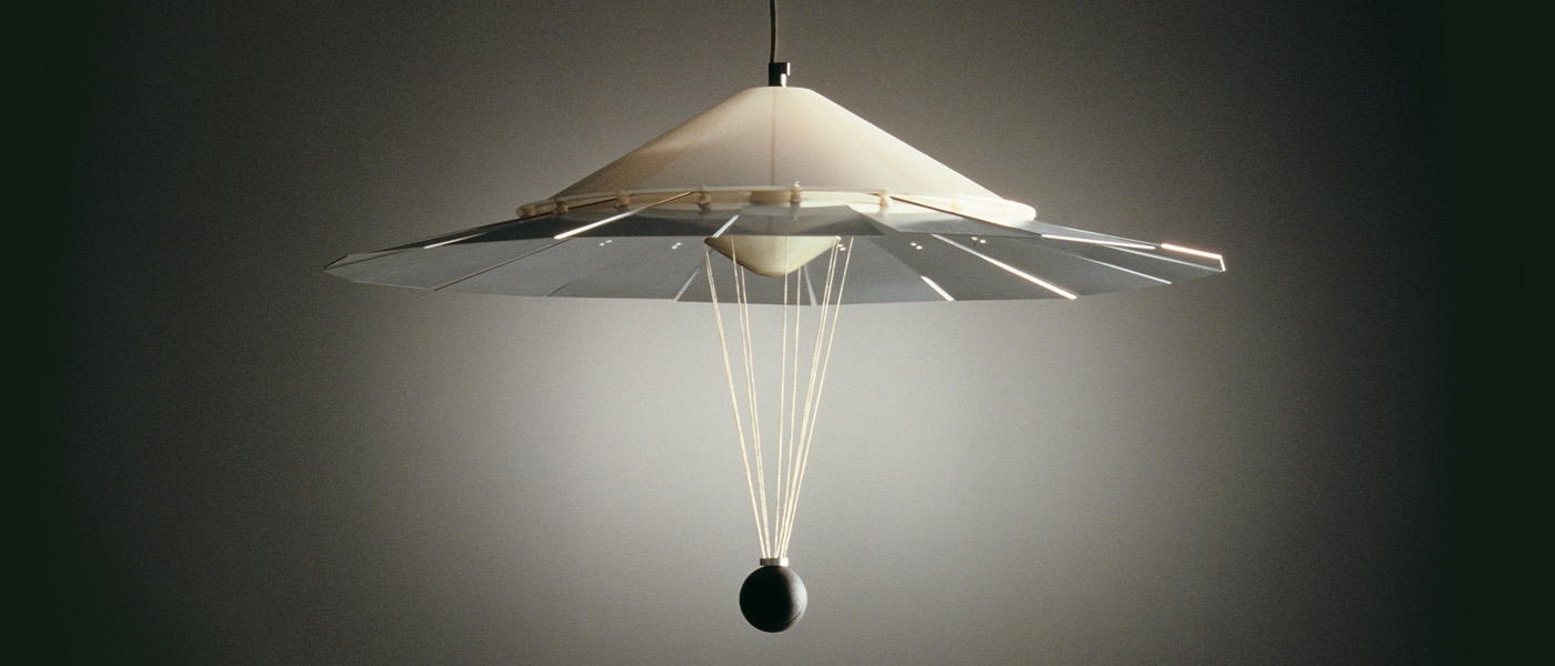
Aletta is a reframe of the classic pendant lamp. The idea evolved from an exercise in the functional limitations of everyday objects and the changing use of domestic space.
An inverting light cone expands light into a room or focuses it on the surface below. A simple adjustment of a counterweight changes this balance, adding a poetic gestural dimension. Aletta received the Forum Design Award, 10 best products - 1989 Milan Salone del Mobile.
Why
Typical pendant dining room lighting is limited to illuminating the narrow focus on the ritual of dining. The innovation of a more responsive light fixture expanded that functionality in a simple way.How
Aletta allows you to affect the quality of lighting in the dining room by adjusting the light source to allow more flexible use of the public/private space. Dividing the lighting cone into segments, hinging each, and connecting them all to a common counter-weight allowed a typical pendant lighting cone to be inverted, with the lightest of touch, allowing a shift in the ambiance of the room with a simple gesture. A downlight focused on the surface and the ritual of dining and the uplight opens up the room - a Promethean gesture.Result
Winner of the Forum Design Award. Aletta was chosen as one of the 10 best products of the 1989 Salone Del Mobile in Milan.Role(s)
Product/Industrial Designer.


NACCA
Print publication, Annual Reports
Print publications for NACCA. A commemorative book design for Canada's National Aboriginal Capital Corporations Association (NACCA), and a series of Annual Reports for print and web.
Why
The National Aboriginal Capital Corporations Association (NACCA) commissioned a commemorative book to describe NACCA's history and to acknowledge the membership of Indigenous Financial Institutions, and their support of successful business ventures across Canada. Subsequently, NACCA commissioned the design of a series of Annual Reports.How
The project was managed by Agentic Digital Media. Working with a project team of writers and in-house communications staff, we developed the initial drafts and mock-ups, and worked through the design development to produce final pre-press documents and oversee the printing of the commemorative book and annual reports.Result
A 96-page hardcover book and dust jacket NACCA: Breaking a Trail to Prosperity. The Vision and Resilience of the Indigenous Financial Institutions Movement (ISSUU pdf) and Annual Reports for multiple years.Role(s)
CD, Book Design, Illustration.


NIKON SCAN UI
UX/UI Design
Nikon UI. The design brief called for UX/UI redesign to appeal to a wider user base. The original UI had been developed by the internal engineering team, and Nikon Digital's management was receptive to adopting a human-centered design process.
Why
Nikon had an excellent line of scanners, however, the original GUI was still based on engineering-centric layouts and process flows, resulting in poor uptake. The redesign would accommodate a wider user base, and provide an improved user experience.How
Working with Nikon management, we introduced a human-centered design process. This was a key shift from specification-driven, engineering-centered design, to a prototype-driven, user-tested, design-driven process. We wanted to provide professional image editors access to the scanner’s high-end capabilities, while also addressing the needs of non-professionals, in a friendly, intuitive user experience. Adopting an iterative process for design development, with design mock-ups, interactive prototypes, and iterative testing of new UI/UX concepts with a diverse user base, provided the ground for the definition of a new human-centric UI specification. This collaborative and iterative design process produced an enduring and unique UI that appealed to a wider user-base and created a valuable human-centric shift in Nikon Digital’s software development.Result
While the objective of the design brief was a new UX/UI, the human-centric shift in Nikon’s software development process was an unexpected outcome.Role(s)
Creative DirectorUX/UI, Design Lead


OMBU
SOFTWARE PRODUCT
Ombu - a cloud-based application for the authoring and sharing of rich-media web experiences. Evolved from field work in building content-driven interactive presentations with clients, Ombu provided a platform and collaborative framework for the creation of compelling interactive stories directly in real-time.
Why
In developing the Walt Disney Concert Hall project, opportunities for time with the client and gaining access to their direct knowledge were scarce. Using Director, we developed a process to create content and rough edits on the fly while in conversation. The approach successfully reduced the content iteration/feedback cycle and allowed us to develop rapidly, making content decisions with the client's expertise. This adaptive workflow of developing content in real-time with the client proved to be highly successful with stakeholders and revealed the opportunity for a more robust, formal application framework.How
We bootstrapped a web application to author and publish rich-media presentations directly in the browser. This collaborative framework allowed teams to author rich media presentations directly during discussions. Leveraging another insight from a previous project was embedding the detail-in-context navigation layer directly over the presentation itself, which created needed flexibility in authoring on the fly, and allowed end-users to navigate the content without getting lost.Result
OMBU was well-received critically and was used by SelfDesign and other clients for developing and publishing courseware and online training.Role(s)
Concept, Creative Director.Ideation, IA, UX/UI.


Health Canada
anti-smoking campaign - proposal
Smoking Will Kill You. In response to a Health Canada RFP, we took a different approach. Moving away from the physical effects of smoking on the body as a deterrent, we opted for a more psychological approach to the communication challenge.
Why
A response to a Health Canada proposal request for a new approach to the anti-smoking campaign.How
The project team moved away from typical representations of physical damage from smoking as a deterrent. Despite years of this approach, people who clearly realized that smoking could kill them, intelligent, informed people still smoked. We played at the edge of a strong and hard-hitting communication program using striking imagery and messaging, to address the emotional and psychological impact, and consequences of smoking – both on the smoker and on the loved ones around them.Result
The result was a fresh approach to imagery and messaging as a deterrent to the continued use of tobacco products. While we did not get the commission, we had fun developing the concept.Role(s)
Creative DirectorIdeation, Creative Direction


SELFDESIGN
STRATEGY | BRAND | IDENTITY | WEBSITE
SelfDesign Learning Foundation is the second-largest K-12 distributed learning institution in BC. A revised communication strategy, visual identity, and website improved the organization’s outreach and growth opportunities.
Why
SelfDesign's learner-centric approach has been a pioneering new model for K-12 education. The organization’s branding and communications had grown in an ad-hoc manner over time and needed re-shaping to meet the growing demand for alternative public education.How
There was a disconnect between the program offerings and the demonstrated demand. The project team worked with the internal communications department to 1) find ways to present their philosophy and innovative programs, and 2) to help parents and families better understand options and help make informed choices for their child’s education.
We collaboratively developed a communication/design strategy, articulated a project development plan and workflow. Sharing best practices with SelfDesign, we conducted a thorough analysis of the existing communications and identity and made core recommendations for shaping a new values-based, user-centric communication culture. We leveraged this to design a clean, outward-looking brand identity, customer-focused communication strategy, and public website. It is steeped in methodologies for passion-based learning and life-long learning engagement. The organization plays an invaluable role in the evolution of K-12 education through its vital service.Result
The project was completed on time and on budget. The resulting work was well regarded by the board, welcomed by the administration, readily adopted by the community-based organization, and helped to galvanize the organization.Role(s)
Creative Direction.Communication strategy, Visual Identity, Site architecture, UX/UI


Radian
visual identity
Along with a redesign of Radian’s communications, was a client request to use a vast in-house archive of field photography. The design challenge was to find a way to work with the client's disparate image base to create a cohesive identity.
Why
Radian Communication Services provided communications infrastructure services, including network design, installation and management, tower engineering, and construction to the telecommunications and broadcast industries. The company required a revised brand, marketing collateral, and look and feel for their communications.How
Along with the request for the redesign of Radian’s communications, came a request to explore ways in which Radian could continue to use their vast archive of field photography. Radian field staff had been documenting remote installations and work projects for some time, however, unlike professional image resources, these included of a very wide range of qualities. Working with Hale Marketing, we came up with a proposal to treat the images and use them in combination with stock photography, to create a flexible, adaptive design program. We achieved great results by working with the idea of collage as narrative, combining and treating the imagery in Photoshop and applying a unifying colour system to create a design program with a high-impact visual treatment.Result
The result was a happy client.Role(s)
Creative Director.Ideation, Creative Direction, Concept Art.


